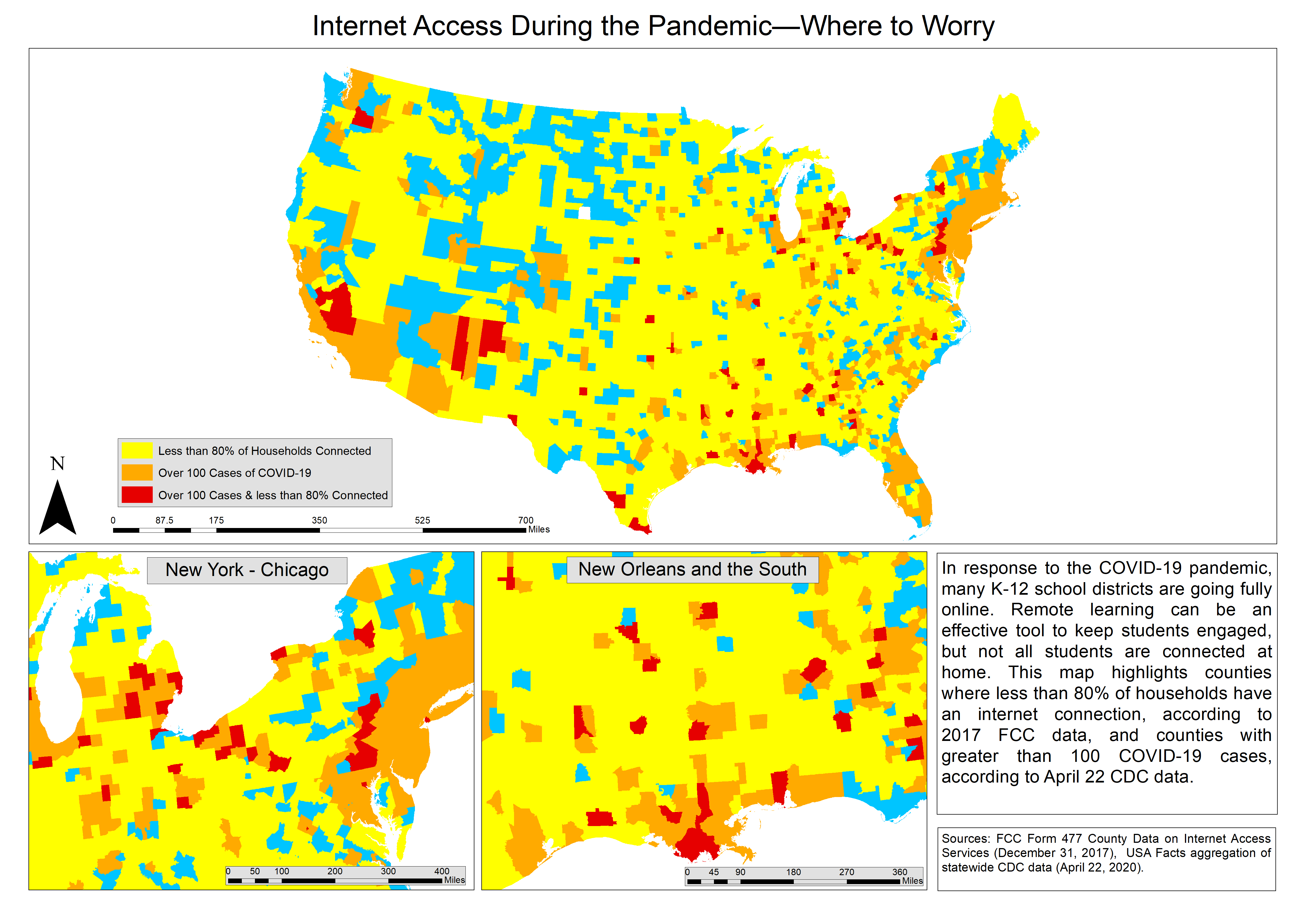
This map was originally created and posted to the blog in April 2020 using data from the same month. My sister who worked in emergency healthcare was sick with what we later learned was COVID 19, so like most Americans the pandemic was on the mind. It seems quaint now that you would even be able to differentiate counties with less than 100 COVID cases. Less than a few months later, this entire map would be majority red with well over 100 cases per county.

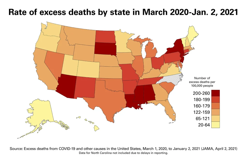
The inset maps represent hot spots early in the pandemic. The first in the northeast, specifically New York City, which was hit hard in early 2020. The second inset map on the deep south, hit hard later in the same year. In April 2021, my two ‘hot spots’ were confirmed by researchers at VCU who calculated high rates of excess death in New York, New Jersey; Louisiana, Mississippi, Georgia. I wish my predictions were wrong.

I was also not the only person concerned about internet access during the pandemic. It became a major policy issue for both state and federal administrations as students studied and workers logged in from home (those who could). One of the largest material outcomes came from the Infrastructure Investment and Jobs Act created the BEAD program, investing over $42 billion broadband access to undeserved areas.
With a few more years of experience under my belt making maps, I have several critiques of the map I created. Mainly:
- Denoting that the blocks used US counties, with a title change
- Blue counties, representing neither of the warmer colors should have been added to the legend
- Data Precision: 80% of “connected” households actually represents those that are undeserved
If you created any maps during the height of the pandemic I recommenced you pull them back up and reflect.